Filling in the blanks with Power Query
Posted · 3 min read · 444 words

A couple of weeks ago I posted on using PowerQuery to visualize my many Xfinity outages. The completist in me couldn’t leave the data along with missing days (essentially the days when my monitoring didn’t log an outage).
This post explains how to add them back in. It’s really pretty simple, using some more advanced Power Query functions. The essential algorithm is:
- Create a list of all the days in the dataset
- Subtract from that list days when there was an outage
- Add that resulting list to the list of outages, filling in the gaps in the data.
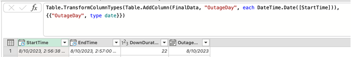
To do that, we need to add a new column to the first dataset, the day of the outage, essentially truncating the start time:
 For simplicity I’m going to ignore outages that span days.
One Power Query can reference another. So the easiest way forward is to create a new query that implements the algorithm above. Here’s the full code:
|
|
The first two lines calculate the earliest and latest outage days in the dataset ’temp’. That way, when the underlying text file changes so too will our dataset.
Next we generate a list of days between the earliest and latest using List.Dates. That function generates a list of dates and requires a start date, a number of days to list and the gap between each date (#duration(1,0,0,0) essentially means 1 day).
List.Difference is like a set minus operation. Given one list (all the days), take away another list (outage days) and return the days that there was not an outage.
From then on, it’s just a case of making the list look like our existing table:
- Table.FromList creates a table
- Table.AddColumn adds the outage duration of 0 for each day
- Table.TransformColumnTypes converts the outage day to a date type
- Table.AddColumn is used, twice, to add start and end times of the outage, which in this case we set to midnight.
- Finally we add this new table with the existing outage table using Table.Combine.
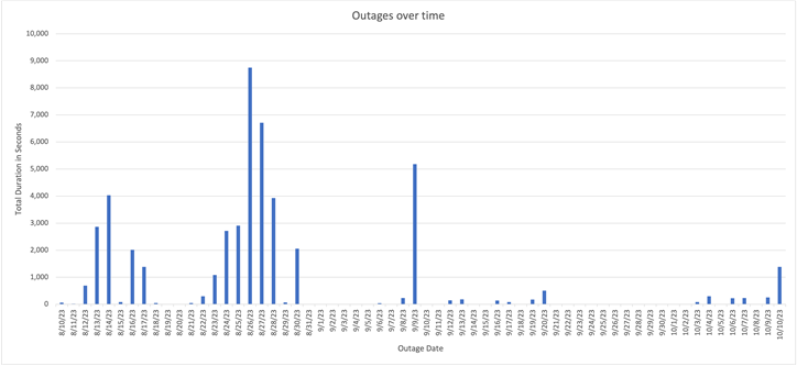
Switch Excel chart to the new table and we finally get a chart with 0 day outages:
If you’ve not tried Power Query, I really encourage you to give it a try. While it has its eccentricities it really is a very powerful tool for manipulating data.